Affordance of Public Touchscreens

Affordance is a term that is difficult to translate into German. The most common designation is "Angebotscharakter" or "character of the offer," which ultimately refers to the possibilities of interaction with an object or interface. In other words, can one infer from its appearance how it is to be used? Affordance can have different qualities, such as distinguishing between physical and perceived affordance.
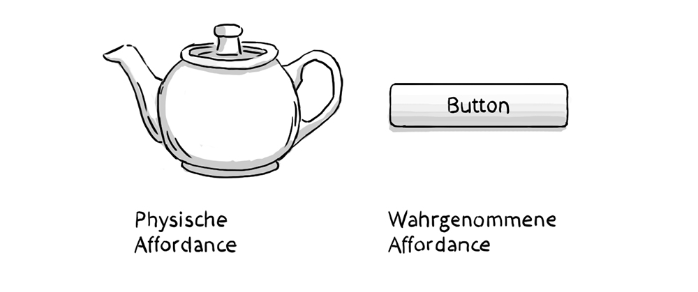
The design of the teapot clearly implies that it should be held by the handle and the spout used for pouring. The digital button has a harder time with this. The concept of affordance partly explains the original trend toward skeuomorphism in interface design. Besides the visual metaphor of a physical push button and thus recognition, it is important that a button looks "pushy." It has a gradient that makes it appear rounded and a distinct shadow that makes it look elevated. If the button has an active state, it is usually depicted as "pressed." These qualities of a digital push button have almost entirely disappeared with the trend toward flat design and anti-skeuomorphism. Here, affordance has also been lost.
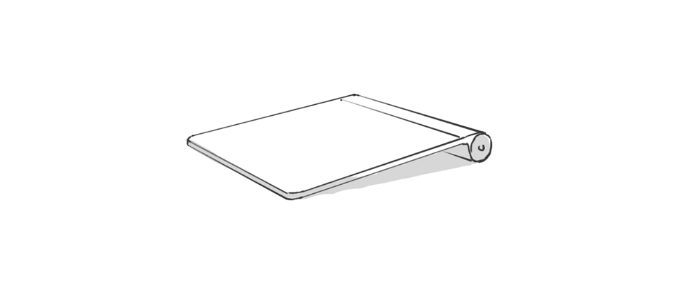
Gesture-controlled interfaces like touchscreens have an affordance problem. They must reveal themselves as usable, and their gestures must be recognized by the user. Thus, two major challenges are apparent. Many gesture-controlled interfaces in smartphones, tablets, or laptop trackpads lack obvious affordance. They do not appear obviously usable. Here, physical and perceived affordance have been replaced by high global proliferation, partly through cultural affordance. Just as one knows that a red light means "stop," one now knows that a trackpad can be operated with fingers. Unfortunately, which gestures it specifically allows is not directly apparent in many cases. It becomes even more difficult when there is no visible element of the interface at all, as with Kinect or Leap Motion interactions.
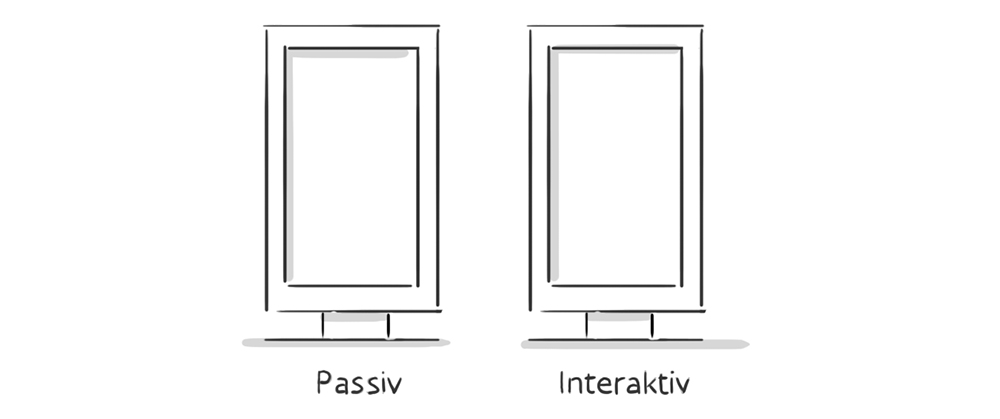
Public touchscreens are not yet as widespread as tablets or trackpads and are rarely positioned within a user's direct interaction area. However, passive information displays are a fixed part of our daily lives. How can a touchscreen have affordance that stands out, even though identical design often prevails?
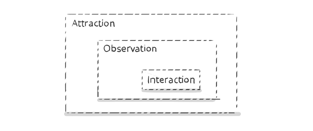
Dan Saffer writes in his book "Designing Gestural Interfaces, 2008" that an interactive display has three zones of engagement. From a distance, the user should be attracted by the offer, known as attraction. In medium proximity, passive information is first conveyed, known as observation. In the personal area, interaction is revealed.
The first hurdle to overcome is attraction. How can I signal that this is not a passive but an interactive display? We also addressed these topics in our project "Nike Community Wall". This interactive display brings Nike's online communities into the store and allows visitors to learn more about Nike products. We experimented a lot with the topic of affordance and usability in public spaces. Here, I want to report on a negative example first. To indicate the interactive nature of the display from afar, we automatically animated certain interface elements in the idle state, when no user was interacting. Content areas opened and closed, and the offer was automatically scrolled. It was assumed that this would visualize the possibility of interaction and invite interaction from a distance. Unfortunately, the complete opposite was the case. Interaction rates decreased. Visitors perceived the display as more passive than before because it did things independently. The possibility of influence was not seen.
How can it be ensured that visitors perceive these displays as interactive in all areas of engagement?
Ways to Signal Possible Interaction
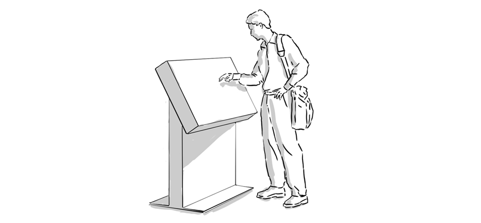
Interacting with touchscreen displays in public spaces still represents a hurdle for most visitors. The devices often look expensive, interaction with them is clearly visible to bystanders, and depending on the size of the display, an unnatural relationship between viewing angle and arm position arises.
Hide the technical character.
By embedding the display in a "human," touch-oriented environment, the technical aspect and the perception that it is an expensive item can be concealed. If the displays are also placed in locations where visitor interaction already occurs, such as fitting rooms, product displays, or checkout areas, their interactive quality can be emphasized.
Consider the size
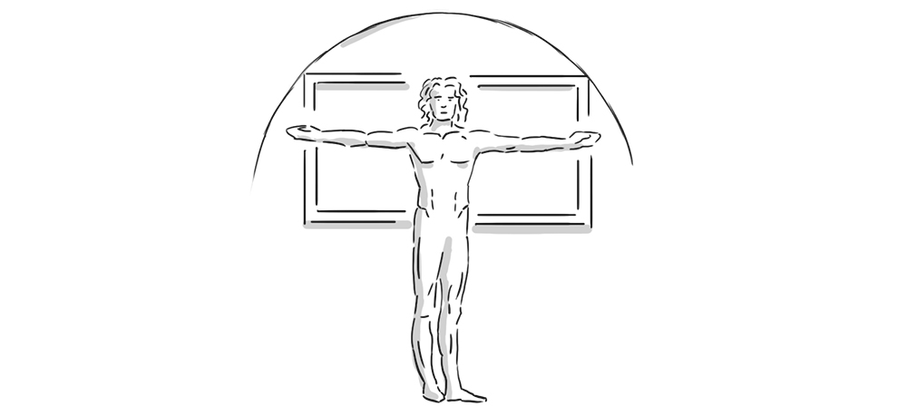
Especially when considering distance effect and impact, one quickly reaches the point where one might say "bigger is better." From a user perspective, however, a maximum display size of about 57 inches makes sense, as at a width of 1.30m and a height of 80cm, all interface areas remain comfortably reachable with one arm.
Natural positioning
A display hanging like a picture on the wall is more likely to be perceived as passive. A slightly tilted display mounted at chest height, on the other hand, appears much more inviting. This partly comes at the expense of distance effect. Modern store design can take this into account and ensure that appropriate sightlines are established.
Signals and additional visual cues
By embedding in an environment that underscores with visual cues that this is an interactive point, the attraction factor can be influenced. The design of the floor nearby can also provide an additional cue. For example, by marking the interactive zone or a step that signals that one can approach the display here.
Attraction affordance in the interface itself
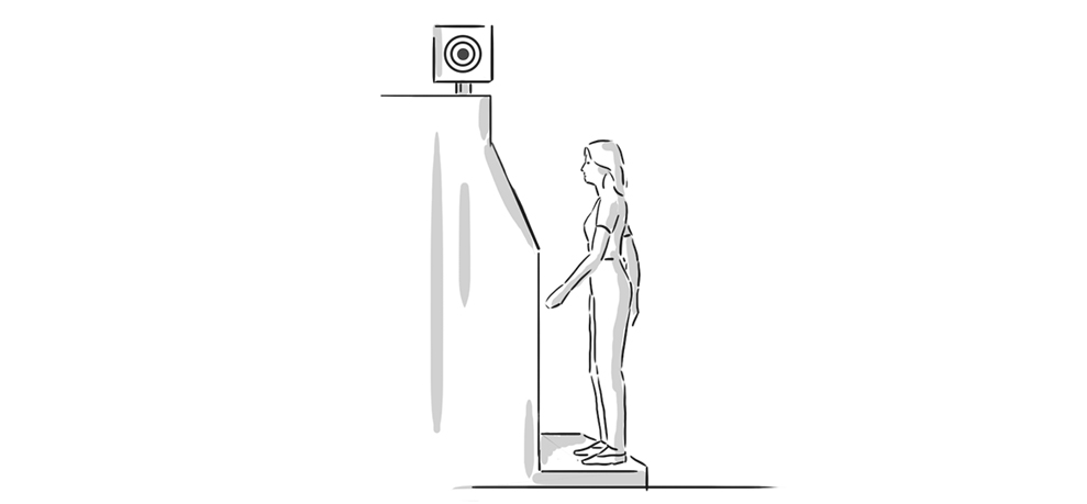
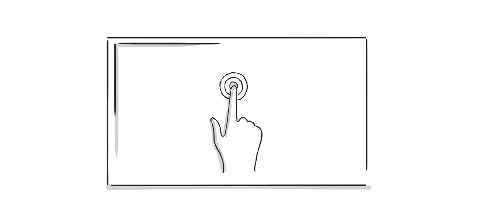
The interface itself can also provide clues that it is an interactive area. The most obvious is probably to directly indicate the entry gesture through an appropriate overlay in the idle state. This can be supported by measuring the distance to the visitor. The hints become more detailed, for example, the closer the visitor approaches the display.
Create a personal area
Interaction in public spaces intrudes into the user's privacy. They are used to interacting with a gesture-based interface in a very personal area. The willingness to try out and explore the interface is higher when no one is looking over their shoulder. Slightly recessing the display into the environment or an explicitly limited possible viewing angle are ways to create a more personal relationship with the display.
Since the introduction of the iPhone in 2007, screen gestures have continuously evolved. Some are already established and, due to their metaphor, inherently very close to humans, such as a swipe gesture to "turn" an area. Others are newer and more obscure, such as a pinch-to-hide-ToDoList-item or a hold-to-send-Snapchat gesture. Due to the widespread use of personal devices, these gestures quickly gain distribution and acceptance. Public touch displays, however, are subject to a much slower development and lower distribution. The hurdle of attraction affordance is likely to decrease significantly in the coming years as users can assume that almost every public display allows interaction.