The brand and its mission, focusing on social engagement, have been modernly showcased with the relaunch of a responsive website.
Client
Lemonaid
Industry
Consumer Goods
Solution
Website
Technology
Web
Services
UX DesignVisual DesignProducingWeb Development

Website Relaunch: Making the brand visible as a social movement.
Why social engagement needed to be made visible.
After the first launch in 2010, the 2013 version was intended not only to look more modern but also to clearly highlight the mission statement and the charitable projects. The website was to become a hub for community, actions, and content while remaining easy to maintain.
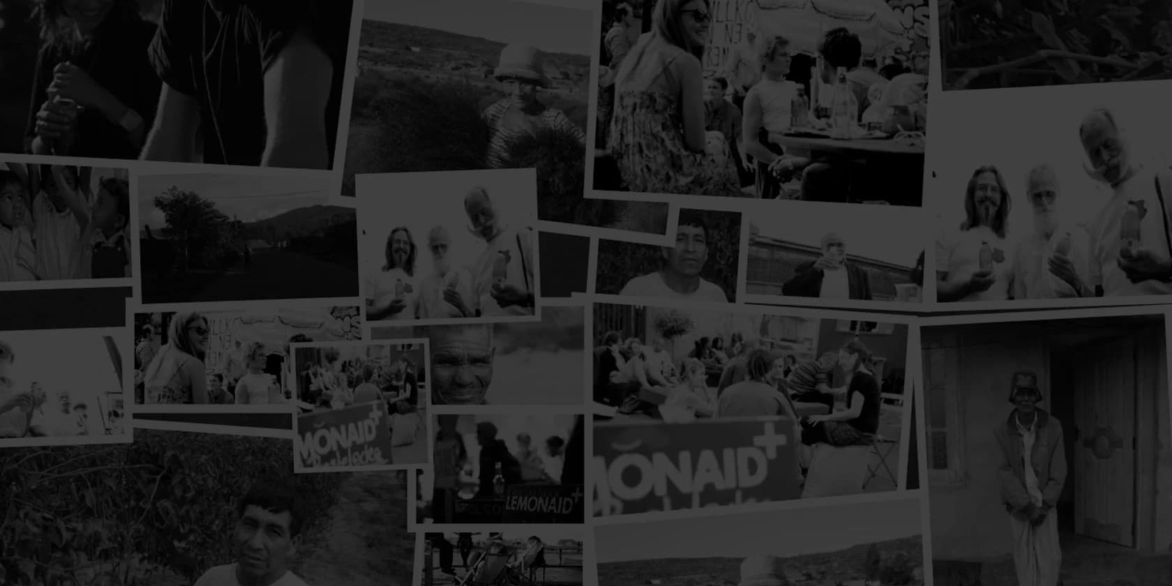
Drinking helps because proceeds and actions support people and projects.
The challenge was to structure the content in such a way that projects and blog entries would dictate the layout while integrating all channels.

A relaunch that puts content at the center.
We developed an optimized information architecture, a responsive frontend, an integrated blog and project area, as well as the connection of all existing Lemonaid channels, so that content could take visual precedence and the site functioned as a central point of contact.
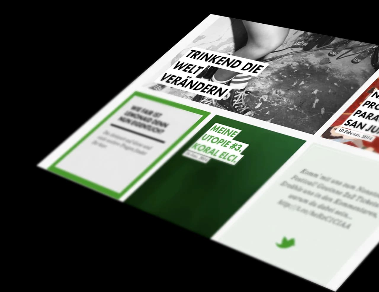
The blog area automatically fills the design grid, allowing posts to take visual precedence and reducing maintenance effort. Projects thus shape the look & feel and bring the lived brand along with the community to the forefront.
Phases from Discover to Launch.
In Discover, we defined the information architecture; in Prototypes, we tested interactions; in Build, we implemented a flexible CMS and a high-performance frontend; and in Launch, we went live with the responsive site. Each step was aimed at bringing content to light easily.

On narrow screens, all modules stack vertically, remain easily readable, and preserve their look & feel. The result is a fully responsive website that makes the brand, its projects, and the community experienceable on any device.
Measurable impact and a stronger brand image.
The relaunch made the social projects more visible and transformed the site into an information hub for community and actions. At the same time, the clear structure reduced maintenance effort, and the authentic design received positive feedback from the target audience.