With the relaunch, we provided the travel provider with a new digital communication strategy – aimed at their new customers and equipped with tools for customer retention.
Client
Eagle Adventure Tours
Industry
Travel & Leisure
Solution
Website
Technology
Web
Services
Technical ConsultingUX DesignArt DirectionVisual DesignProducingWeb Development

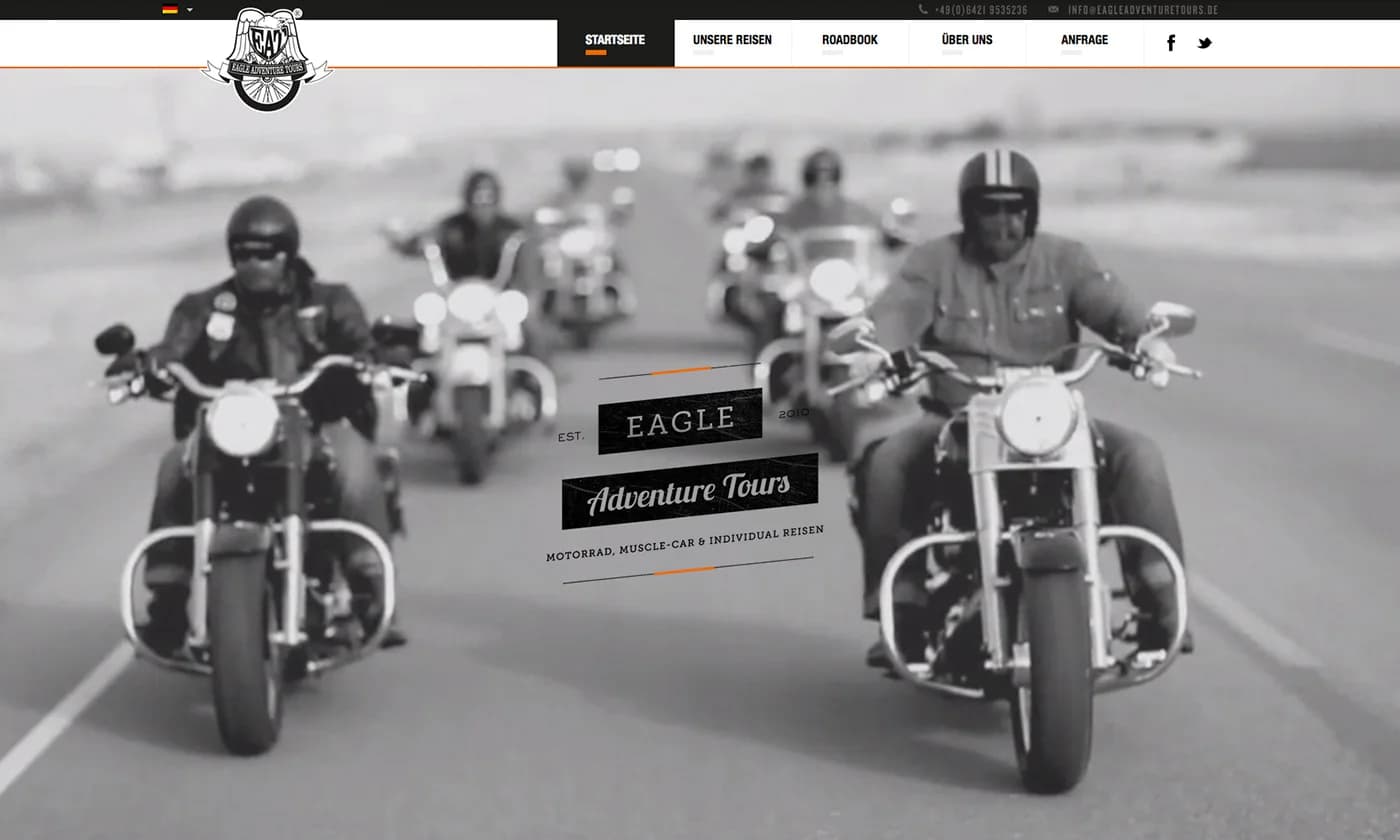
A digital experience that makes adventure palpable from the very first click.
Travelers seek authenticity, clear orientation, and easy booking.
Eagle Adventure Tours needed a website that instantly conveys the fascination of individual motorcycle trips, reduces booking abandonment, and generates measurable increases in conversions and higher mobile engagement. The KPIs focused on conversion, shortened checkout time, and customer satisfaction.
The goal was to create an emotional and user-friendly booking environment.
The target audience consists of premium bikers who expect story, imagery, and a streamlined mobile experience; relevant touchpoints include social ads, organic search, and direct email outreach.
A digital communication strategy connects brand, booking, and personal support.
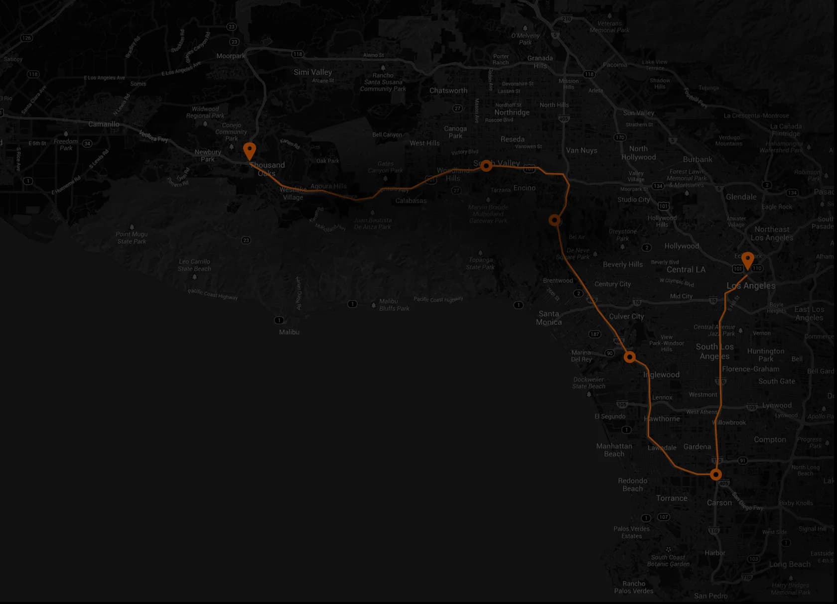
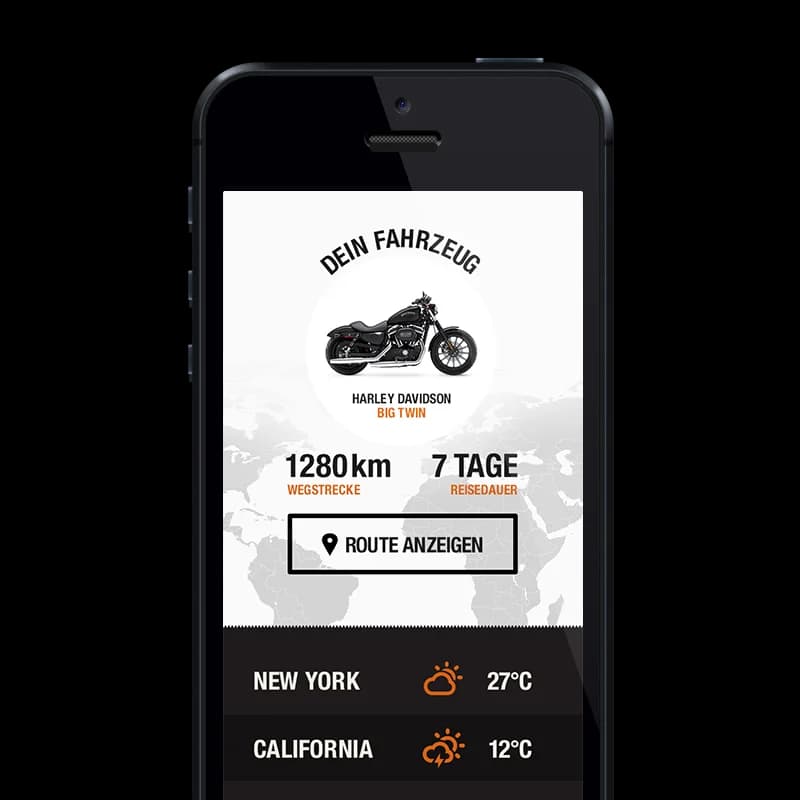
Delivered was a reduced, progressive booking concept, a cinematic imagery world, a custom-developed icon and color scheme in black/orange, responsive templates, and a CRM-based microsite system that accompanies each traveler as a virtual companion.

The mobile-optimized microsite acts as a personal travel companion: all documents are bundled, service contacts are immediately accessible, and users receive situational hints that create safety and comfort on the go.

Cinematic hero moments and authentic image sequences emotionally stage the routes and gradually lead visitors to their decision. The combination of moving images, concise headlines, and clear visual language evokes anticipation and reduces uncertainty.
Technology in the service of experience delivery.
Technology and integrations serve the experience: fast loading times, mobile optimization, easy connection to the CRM, and a flexible content architecture enable personalized microsites and a smooth booking process without unnecessary steps.
The reduced color scheme in black and orange creates an instantly recognizable look that combines retro authenticity with modern readability. Icons provide orientation, photos spark a sense of adventure, and together they form a clear, emotional brand guidance.
Measurable increase in conversion and stronger customer loyalty.
After the relaunch, the booking completion rate increased by 28 percent, and the average time to checkout decreased by 35 percent; advisors reported less pre-support, and guests praised the microsite as a reliable travel companion.